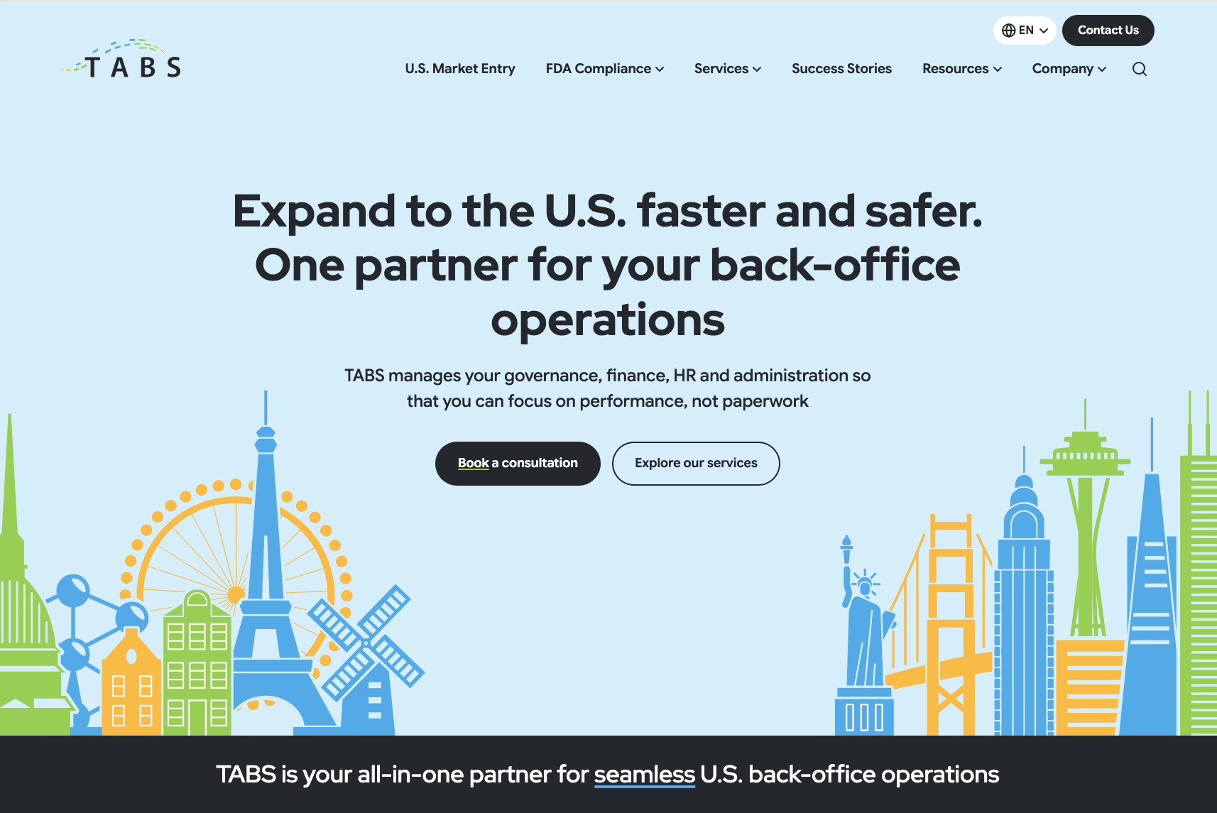
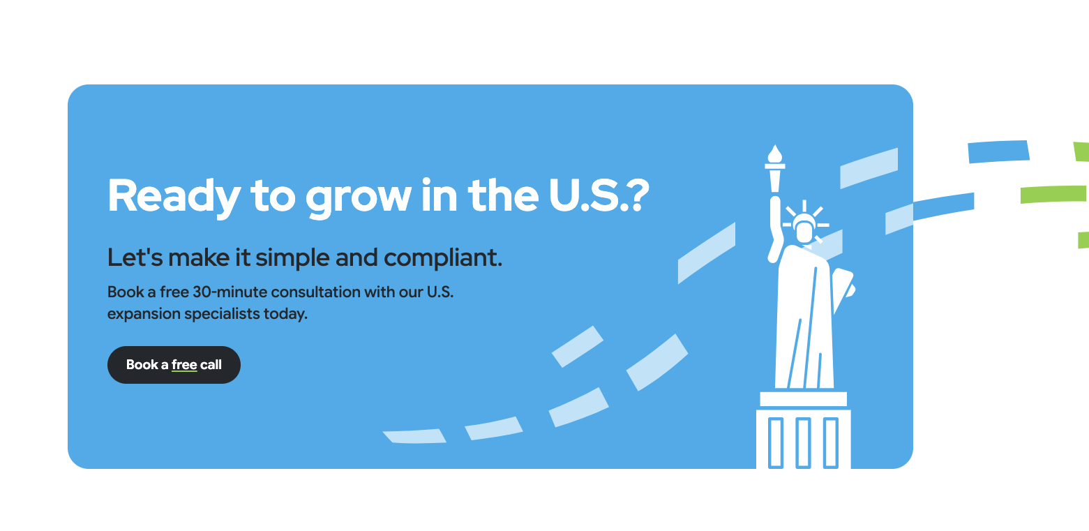
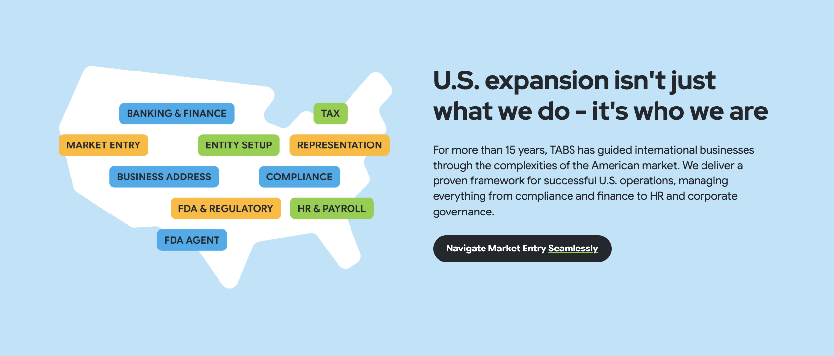
We developed the new website on Kooboo and migrated TABS away from WordPress. The site was set up as a high-conversion platform: clearly structured around the six core services, optimised for SEO and ready for multilingual growth. In a phased approach we first delivered the English-language website, followed by the Spanish-language expansion and ongoing content optimisation, with canonical and hreflang arrangements to keep language versions neatly separated.
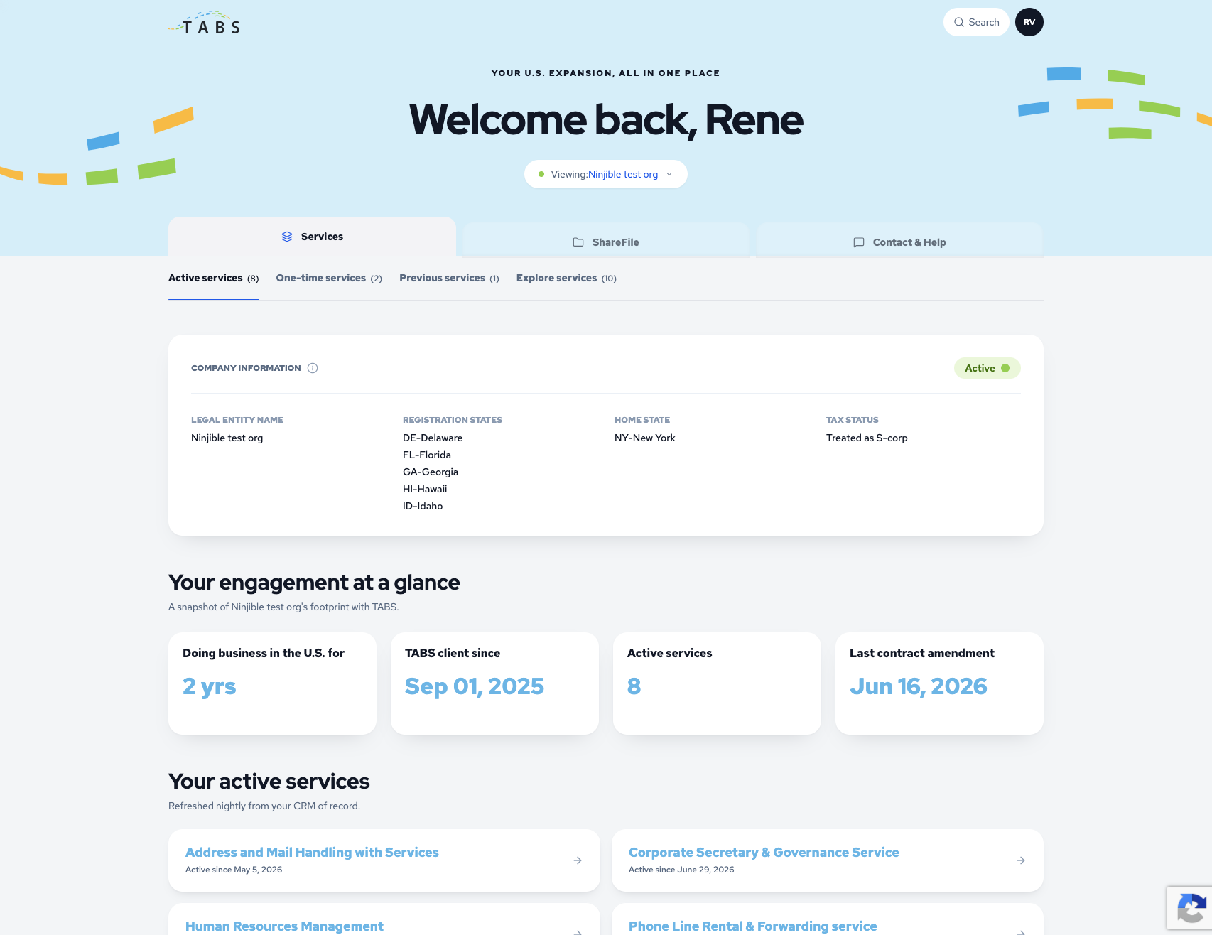
In parallel we built portal.tabsinc.com: a secure client portal that turns the website into a real ecosystem. The portal is linked to the CRM (Insightly), so client data comes together in one place, and runs on the same Kooboo foundation and hosting as the site. Security and reliability came first in the build:
- Secure access via magic links and token-based authentication
- Robust error handling: features load independently of each other, with proper error pages instead of a blank screen
- Careful logging of technical errors with reference numbers, without leaking internal details to the user
- CRM integration with Insightly as the central source of client data
To be able to track the portal's performance, we also set up a recurring GA4 dashboard that gives insight into usage, active users, sessions and engagement.
A bold design system: Modern Confident
At the base of it all is our own design system that we developed under the name Modern Confident. Not a rebrand, but a self-assured evolution of the TABS brand: made to future-proof the identity for an international, tech-oriented B2B audience. The tone is global, modern and assertive and warm and human. What characterises the system:
- An open, calm layout with plenty of space, radiating trust and clarity
- A distinctive brand motif that runs as a common thread across the entire site
- Warm, pastel colours that soften the strong primary tones, with a warm accent colour for calls to action
- Real, human photography instead of recognisable stock images, framed in calm image sections
- Polished typography and deliberately less icon clutter — icons only where they clarify
- Accessible and bilingual (EN/ES), set up according to the applicable accessibility guidelines (WCAG, ADA, EAA)
This design system runs consistently across the whole website and the client portal, so that the outside and the inside feel like one brand.